
JobStop
Helping people to find jobs in their fields.


Project
JobStop is a mobile application that helps people everywhere find a job that desire. The jobs could range from having different classifications, location and salary amongst other factors. The app is designed for those who are actively or inactively looking for a job. The project process starts from ideating, competitors’ analysis, user research through interviews and persona hypothesis, user flows, information architecture. It is then followed by wireframing, prototyping, usability testing and finally creating a high-fidelity first version of the app design.
Link
Details
Amanda Widjaja – Solo Project
Mentor
Daniel Williams
Full Case Study
The Problem
The idea for this project came from my friends who are also in this class. They are international students who find it hard to find design jobs since they cannot work full-time and a lot of them resort to working part-time jobs in retail or hospitality. I want to make a product that can help international students to find jobs in different fields while taking into account the location too.
Competitors'
Analysis
A competitor analysis was conducted across 3 apps, SEEK, Indeed Jobs and LinkedIn. These apps provide a comparison between the ways people use to find a job as well as provides information on the features needed for a minimum viable product and shows possible opportunities JobStop can improve upon. 39 heuristics were compared between the websites and the findings of what heuristics an MVP should have are:
Audience & Design: A simple, clean, sleek design that looks professional. A tab bar can also be included that looks simple and has clear icons.
Navigation: The simplest and clearest amount of steps needed to search for a job, with tab bar being clear and showing the necessary function buttons in the according tabs.
Search: Search function should be the main feature of the app and there should be an option to minimize or maximize the filters before searching.
Job Recommendations: The website should recommend the jobs accordingly to the proper position of each user.
Search Filters: The search filters should have the most important filters shown, while the less used filters can be hidden at first glance.
Employers: There should be a company rating and employee reviews. The companies should also have a profile page that can show the jobs available in the company as well as posts.
Profile: The user should be able to customise his/her profile according to how they want. There should be a lot of variety on the details they choose to show. They should be able to network if they choose to.


Competitors’ Analysis data gathered.
User Research
10 people were interviewed over the course of 3 weeks and the interviews consists of questions to gain insight on user behaviours, goals and attitudes. They ranged from age 18-31 varying in gender, age and professions. Interview questions and answers can be viewed on the appendices section of the research report.
The interviews showed that most people want to easily search for a job that are dependant on their situation. Factors include if they are studying or not, time available to them, job position, salary, the employers and perception on the post. There were a number of similarities, that most people want to easily edit and send their resumes, get job recommendations according to the fields they want to work at, more information on their employers and future possible workplace and an easy, simple app to use.
Further research should include a clearer age group, maybe even those ranging above 50 that could have affected technological factors more, as well as people more variety of industries. Additionally more people from regional locations should be interviewed, rather than just those from cities.
Opportunities:
It is identified that opportunities include a resume editing feature, resume storing feature, cover letter storing feature, list and status of jobs applied to, ability to contact employers, company rating, employee reviews and proper job recommendations.


User interviews data gathered including questions & answers.
Personas &
User Journeys
The interviews revealed three personas segmented based on behaviour, but only 2 will be analysed for the MVP.
Below are the personas that are going to be analysed:
Employed Job-Seekers (Active) are users that have a job, either through online or networking. Since they have a job, they might go to job search apps to search for a job with a higher position because they are tired of their current one and want to switch it up, looking for new possible opportunities.
Unemployed Job-Seekers are users that are open to jobs because they do not have a job yet or isn’t looking for one due to studying or other reasons. They tend to apply to a large amount of jobs to get a job opportunity.
Below is the persona that requires further research:
Employed Job-Seekers (Passive) are users that have a job, but are very happy with their job. They occasionally browse to see jobs, but rarely.


User personas & User Journey Maps
Information Architecture
From the user research (personas and customer journey maps), the following key findings are identified as those that will improve the user experience.
The main points that users want are:
- A simple, effective search bar that can differentiate between job keywords, location as well as industry classifications searches
- Good navigation in the app
- A complete filter when expanded, but important filters are prioritised that help with categories like classification, industry and location
- Job recommendations based on interested classifications
- Ability to save jobs that the user are interested in
- A list of status of applied jobs
- Communication with possible employers
- Pictures/images of workplace
- Abilities to filter jobs nearby
The key goal of the app is to provide the users with most convenient way to search for jobs with ease, according to which industry they want to apply to. To increase ease, there should be the abillity to save jobs as well as to save different resume versions and cover letters. The app has to be simple and clear in design, while having clear navigation as well as some personalisation.
The Minimum Viable Product (MVP) will have:
- A functional search bar for all users
- Save jobs and apply in computer feature
- Workplace images
- Ability to store multiple resumes
- Ability to edit resumes
- Job Recommendations according to fields chosen
- Ability to make a cover letter template and store different versions
- Show nearby jobs
- Company rating and employee reviews
- Complete information on each job
- Chat with employer feature
- List of Applied jobs’ status
- Ability to see competitors applying to the same job


Entity Attribute Breakdown table: Listing all the necessary Attributes needed for a Minimum Viable Product (MVP).

A one page marketing site for the app.
Prototype
A prototype was created in Axure to conduct usability testing to create and polish a Minimum Viable Product. Below is the annotated wireframe documentation for all the pages in the prototype created from the entity attribute breakdown.


Annotated Wireframes of the prototype created for the user testing.
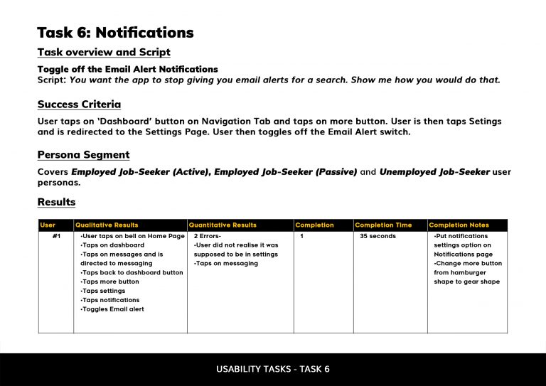
Usability Testing
A testing and recruitment plan was created, which included scripts of tasks for usability testing of JobStop’s prototype. The tasks are meant to test if the key features provided by the opp (e.g. applying and searching for a job) work and whether they provide good user experience. Each task has a success criteria which will determine the success rate of each task.
A usability test was conducted on 7 participants who represented three different key personas for the product. The participants are given the tasks and data of each test are compiled to determine key findings and propose recommendations to fix any usability issues identified.
The main findings of the test were 1) users loved the map feature that shows nearby jobs, 2) users completed most of the tasks given to them while using the prototype (especially the simple ones are completed relatively fast), but need to get used to more complex features like adding resumes and messaging, 3) most users find the website easy and simple to navigate around due to the clear navigation tabs.


Annotated Wireframes of the prototype created for the user testing.
High-Fidelity Design

High-fidelity design of how the app will look like.
Findings & Next Steps
JobStop’s user experience will be improved from the recommendations suggested from the users testing the prototype. The product will need to have convenience in navigating the product, a dashboard with useful features as well as complete information on each job page with a good and efficient layout that is pleasing to the eye. Good, simple and clear visuals for each job page and a good amount of filters (if wanted) for searching jobs, the ease to apply for jobs as well as having editing and adding multiple resumes are also essential towards providing a suitable user experience. Further research can also be done with a wider pool of demographics in order to get more data for improvements.