YumoYum
One-stop site for Foodies.
Project
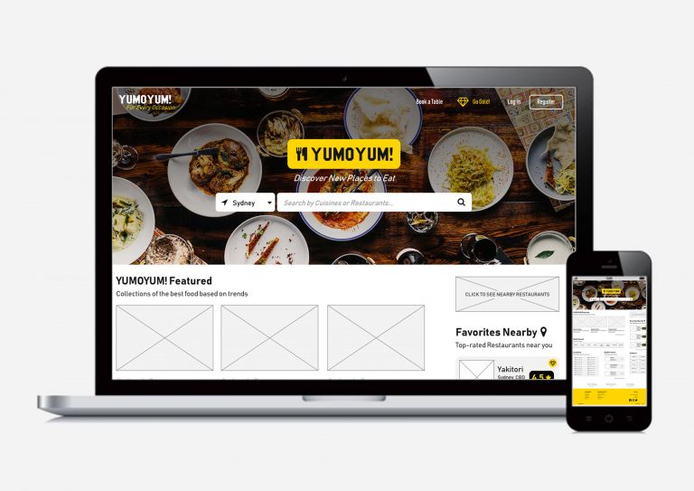
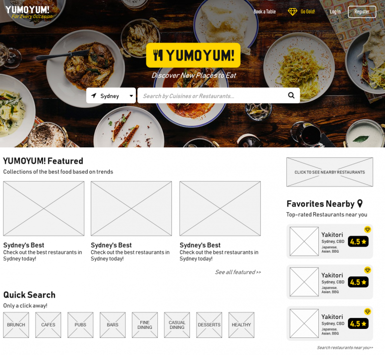
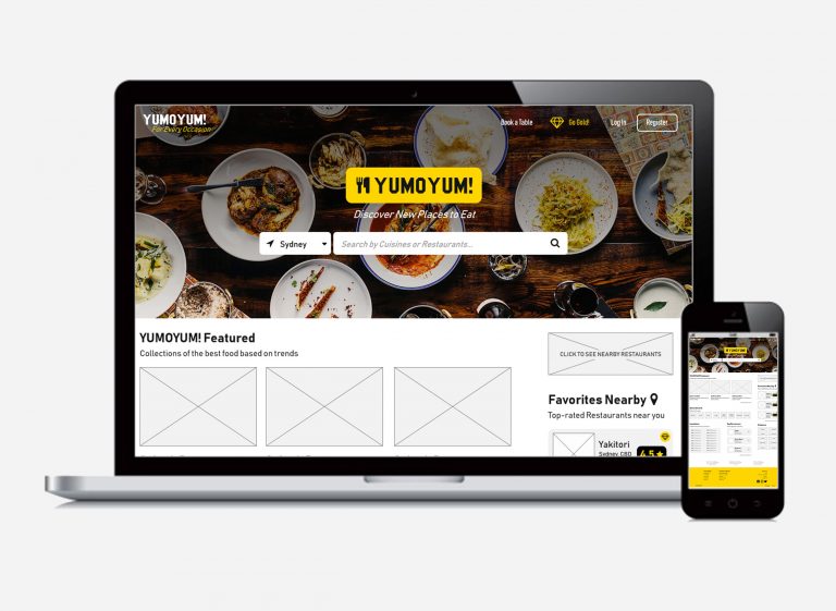
yumoyum.com is a website to help people everywhere choose their desired restaurant to eat, according to the quality, price and other factors. The website is designed for those who are both picky with their restaurants, people with special diets, or those that just wants to look for a new restaurant. The website will have many features that would make it a one-stop website for reviews, booking, searching restaurants as well as providing information on offers available and a website membership that will include special discounts and promotions.
Competitors'
Analysis
A competitor analysis was conducted across 3 websites, Zomato.com/Sydney, TheFork.com/au, TimeOut.com/sydney. These website provides a comparison between the ways people might have chosen to look for restaurant reviews. All 3 has targets to get as much website visitors as possible with having possibly different audiences. The 3 websites all have restaurant reviews and thus, information on many restaurants.
The heuristics compared were look & feel, Search options, Navigation, Result Filters, Primary Content, Secondary Content, Primary Audience, Secondary Audience, Site Goals, User-Generated Content vs Authoritative, Website Account, Subscriptions, Membership for Restaurants, Advertisement Offers, Blog, Extra Features, Distinguishing Interactions, Booking a Table, Special Offers, Responsive Design, Download Application Link, Application Availability, Mobile Site, Social Media, Facebook, Instagram, Website Globalisation and Special Facts. Below are details on the comparisons:
Audience & Design: Zomato and TheFork have similar audiences, people that usually check ratings for places that they might go to, food reviewers and foodies. They have secondary audiences including reviewers and restaurant owners. However, Zomato’s design looks more polished and appealing compared to TheFork’s. TimeOut’s audiences focuses more on people who want to travel to Sydney and more towards the author of each posts’ suggestions on restaurants. TimeOut’s aesthetics focuses more on a magazine look that is aesthetically pleasing.
Navigation: Zomato has the clearest structure, a search bar that shows what to search and a book a table button. They also have recommendations that are in categories. TheFork’s navigation is pretty confusing, as they recommend restaurants in blogs. The search bar also focuses more on time availabilities and booking process. TimeOut has most restaurants in posts and you’ll need to select the post to view information on the restaurants.
Search: All 3 websites have a good search page that directly shows the restaurants or cuisines searched.
Filtering System: Zomato and TheFork both have great filtering systems with a lot of choices to pick. Zomato is just lacking a special offer filter which TheFork has. TimeOut combines all the travel and restaurant filters together so it is harder to find a restaurant through TimeOut.
Wide Range: Zomato has the largest range of restaurants between the websites.
Clarity in Information: Being able to see clearly all the information of the restaurants including Menu, address and phone number is clearer on Zomato and TheFork. Zomato has more information on the diets/etc. of each restaurant.
Rating and Reviews: 2 out of the 3 websites (Zomato and TheFork) show ratings on each restaurant. TimeOut focuses more on a critic’s review while the other 2 shows a wide range of reviews that include verified and normal user reviews.
Special Offers: All 3 of the websites provide special offers, but TheForkprovides the best navigation for the offers.
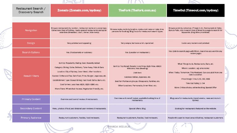
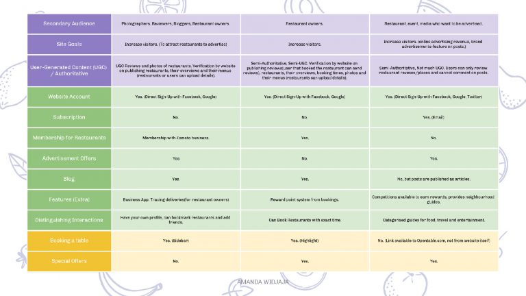
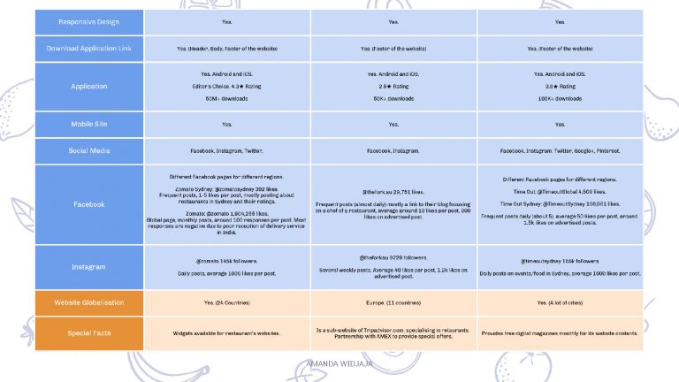
Competitors’ Analysis data gathered.
Possible Features
It was identified that the features the website can have include recommendations of the food on the restaurant’s page, stronger social media presence, recommendation section of the website, special offers through membership as well as the option for restaurants to interact more with their customers through claiming the restaurant’s page in the website.
User Research
User research was also conducted with 12 interviewees, questioned on their attitudes, behaviours and goals in relation to their restaurant experiences. The main points of the user research are that 1) users that use restaurant search websites use it to look for menu and see ratings and reviews, 2) users that do not use the search website do not use them because they do not really care about reviews, but they might use it if they provide special offers, 3) most people want a website with simple navigation that will take them the least amount of effort to get what they want out of it. 2 personas were established from the user research.
Further research should include a clearer age group, maybe even those ranging above 50 that could have affected technological factors more, as well as different customer journey processes. Additionally, more people from regional locations should be interviewed, rather than just those from cities.
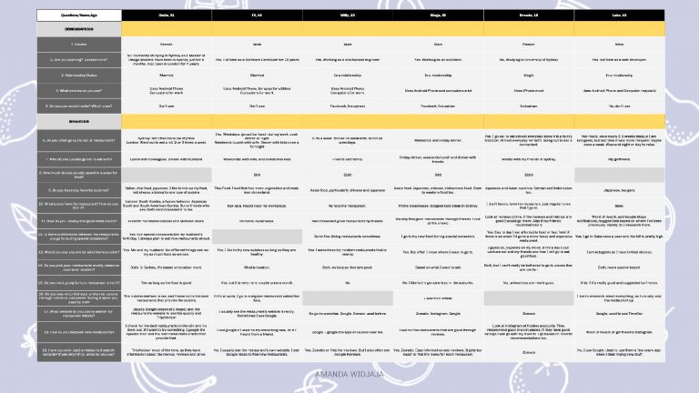
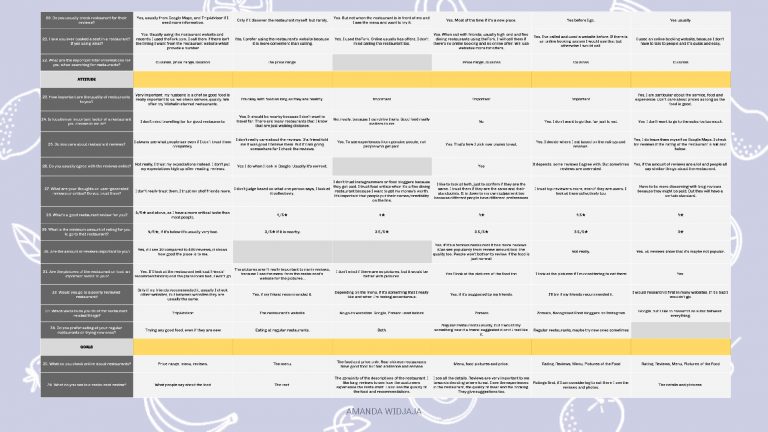
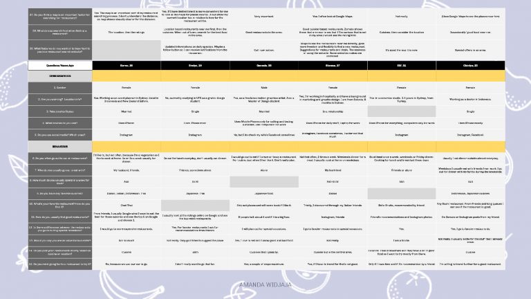
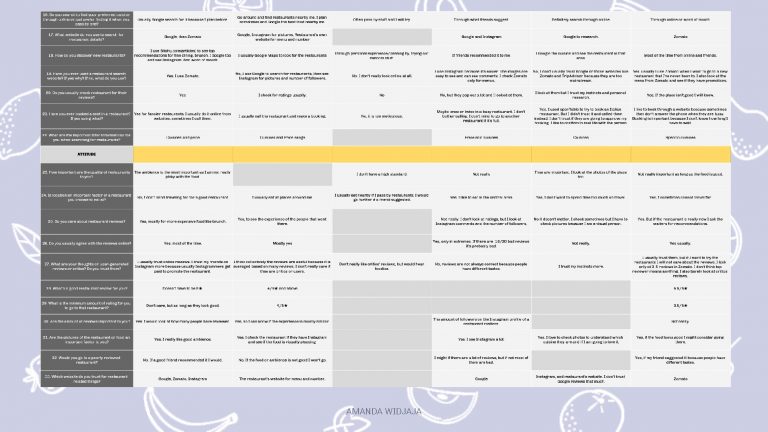
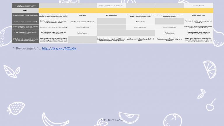
User research interview documentation.
Key Findings
Convenience of the Product: Most people want to press the least buttons to see what they want. So the navigation should be simple and clear. Simplicity of the website also plays a huge part in popularity. The look of the website should look clean and simple. The search bar also plays a big part in the navigation, that the search bar should include location and cuisines.
Rating: Almost everyone interviewed that opens restaurant search websites focuses on the rating, then the reviews. The rating and the amount represent the popularity of the restaurants.
Complete information: Most people want to press the least buttons to see what they want. So the navigation should be simple and clear. Simplicity of the website also plays a huge part in popularity. The look of the website should look clean and simple. The search bar also plays a big part in the navigation, that the search bar should include location and cuisines. A restaurant search website will have more visitors if it has all complete information in one place, which includes menus and phone numbers which people usually see when they go online to search for restaurants. Further additions could include their dining times, special diets, kid-friendliness, booking availability, food recommendations from the restaurant. A restaurant’s page should be a one-stop place for a user to go to.
Visual: Visuals of a restaurant play a big part in the page. People tend to be satisfied with looking at pictures that look better, so the restaurant should have an opportunity to upload their official pictures of food and ambience on the page.
Filters/Categories: Most people interviewed have favourite cuisines and price, so the filters play a huge part of the search process. By using the filters, the search results should show the top rated restaurants for that particular cuisine. Other categories can further narrow down what the user wants.
Contact directly: Users say that it would be more convenient to be able to call the restaurant directly, or even having the option to book through the website. There should be a description that the booking will be received by the restaurant and the user will be notified when the booking is confirmed. **Because of this there needs to be an option to add more restaurants/list new restaurants.
Opportunities
It was identified that opportunities include a map like Google Maps, daily specials and notifications updated by each restaurant, ability to see which restaurants have special offers, friend’s suggestions/been there, reward point system for reviewing and sharing, making reviews into posts in Instagram and must-try recommendations.
Personas
The interviews revealed two personas segmented based on behaviour.
Hearty Eaters are diners that usually research online and the research determines where they eat. They usually make sure that the restaurant is in top quality before planning to eat there.
Unfussy Eaters are diners that prefer the thrill of discovering the quality of restaurants themselves, and usually are okay with eating at normal reviewed restaurants. If they check online for restaurants they will check mainly only for information and menus.
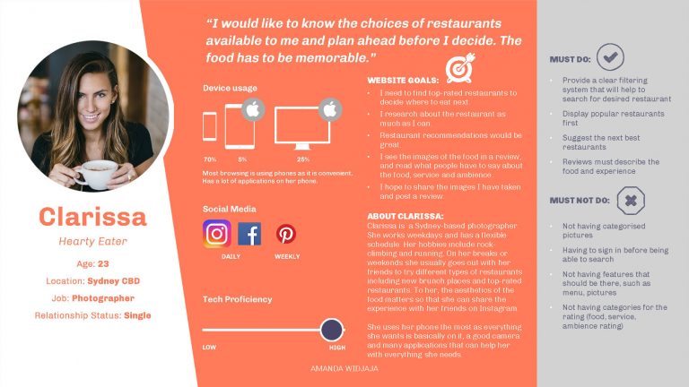
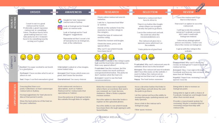
A persona of a Hearty Eater & the persona’s user journey map.
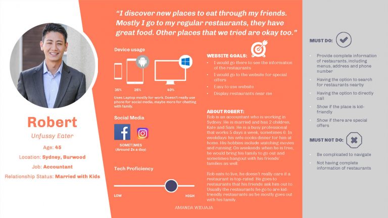
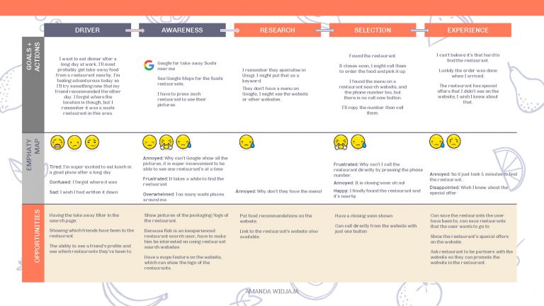
A persona of an Unufussy Eater & the persona’s user journey map.
Information Architecture
The key goal of the website is to provide the users with most convenient way to search for a restaurant, while providing the best experience through complete supply of information on the food, restaurant, ratings, reviews and many others. Official photos of the restaurants will provide a verified image that users will trust. Partnership between the website and restaurant can result in more special offers for the user. The website has to be simple and clear in design, while having many features. An entity attribute breakdown is created to list down everything a Minimum Viable Product would need to have.
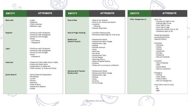
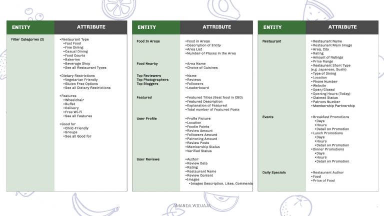
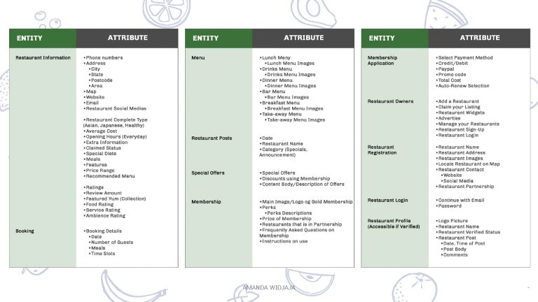
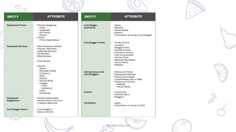
An entity attribute breakdown for the most essential pages of the website.
Prototype
A prototype was created for the purpose of usability testing. The prototype, made in Axure includes all the features necessary to test and create a future MVP from the findings of the testings.
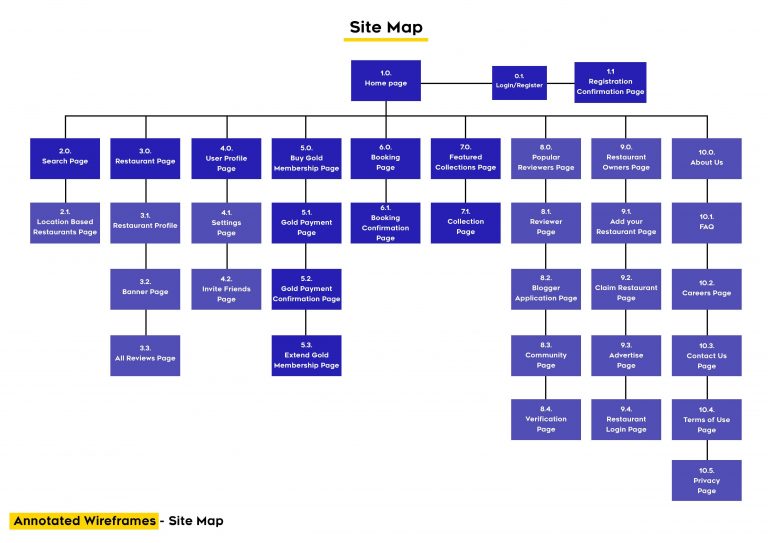
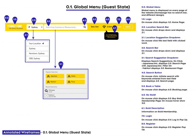
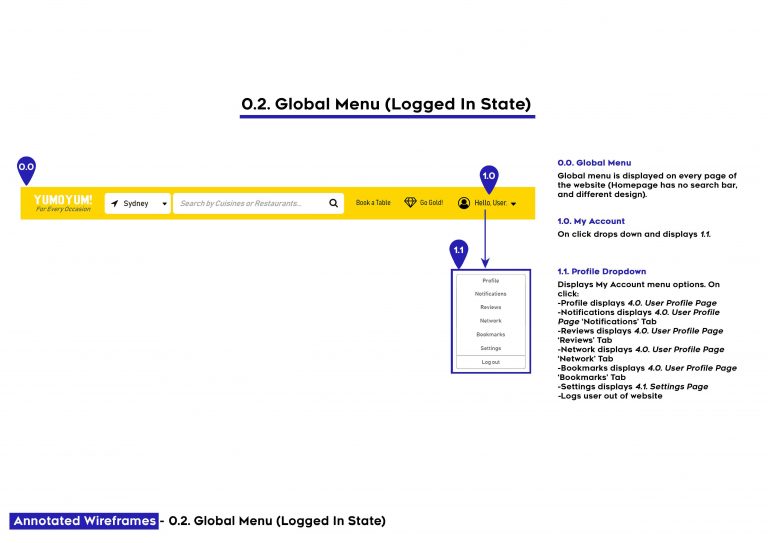
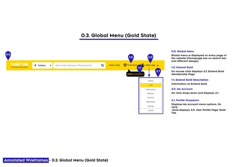
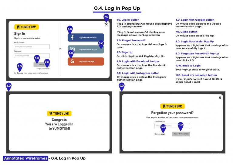
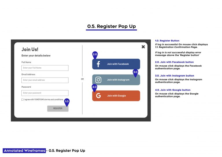
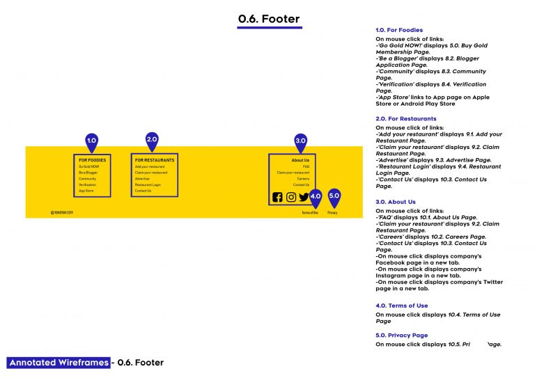
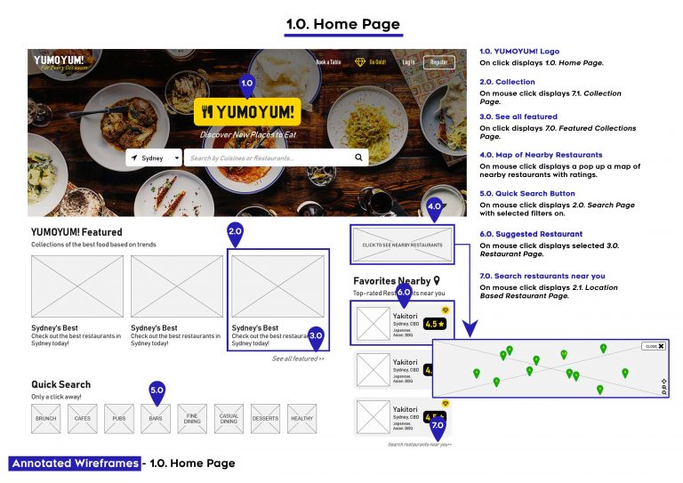
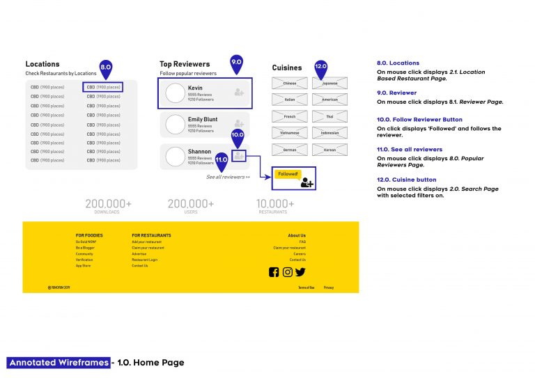
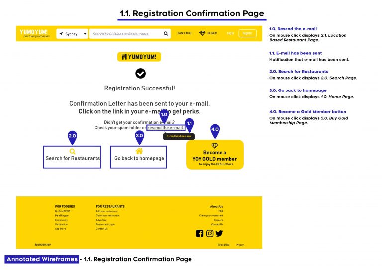
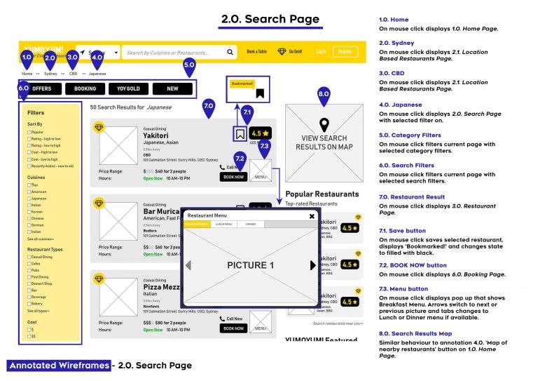
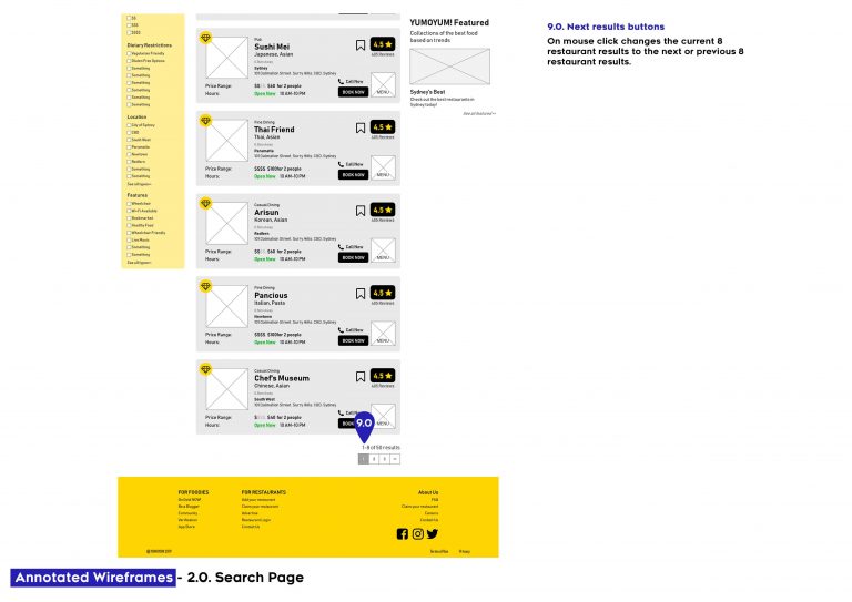
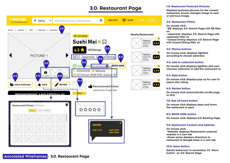
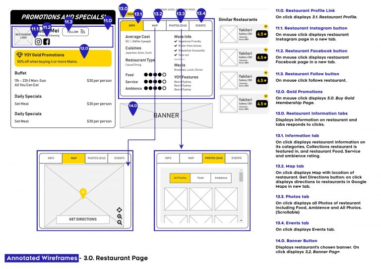
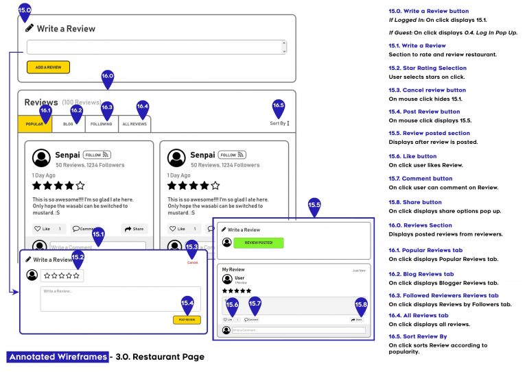
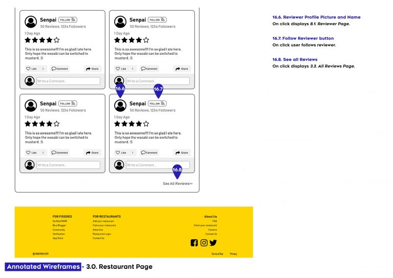
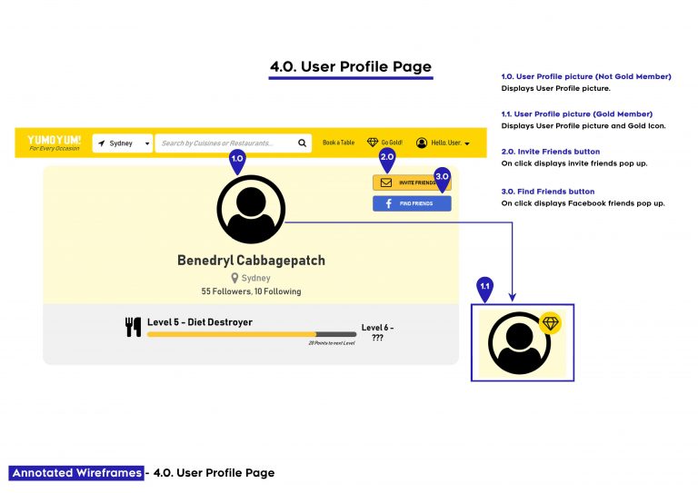
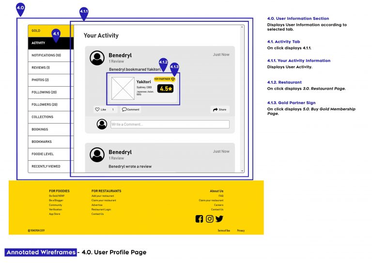
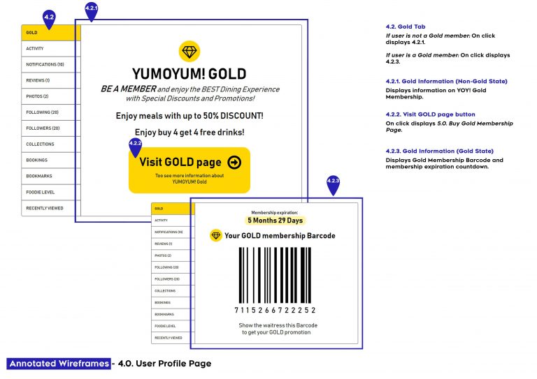
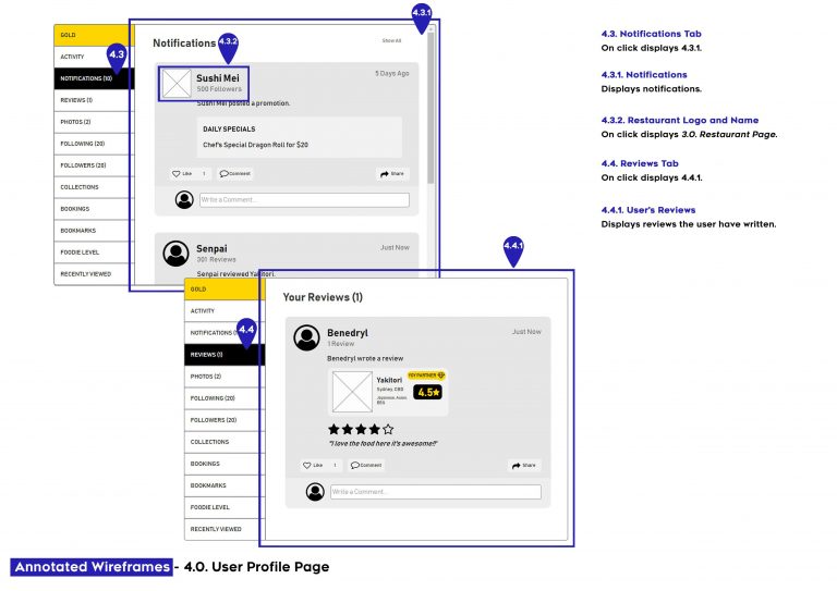
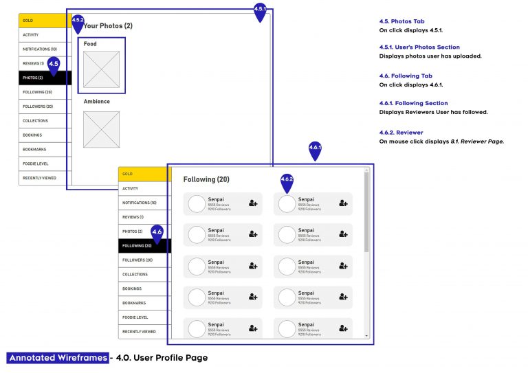
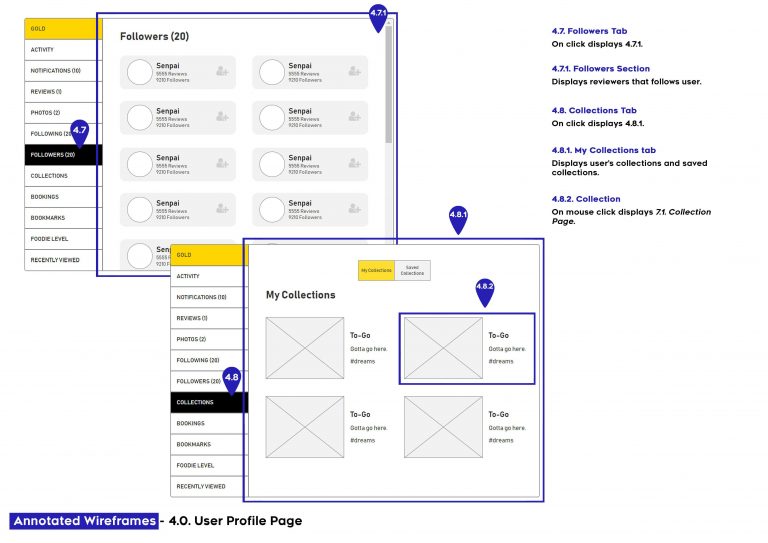
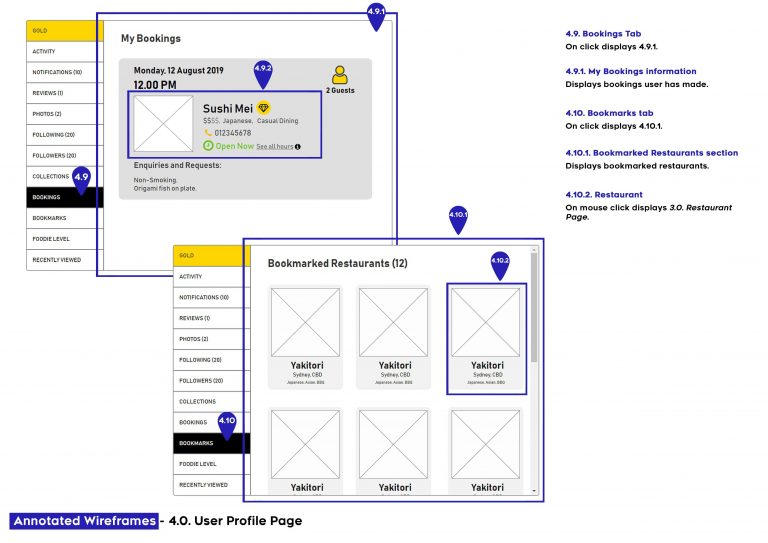
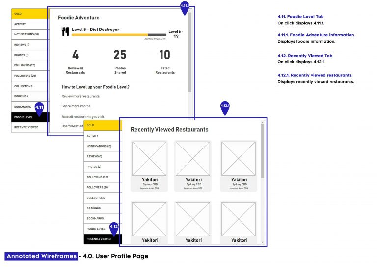
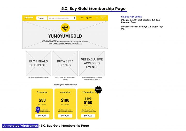
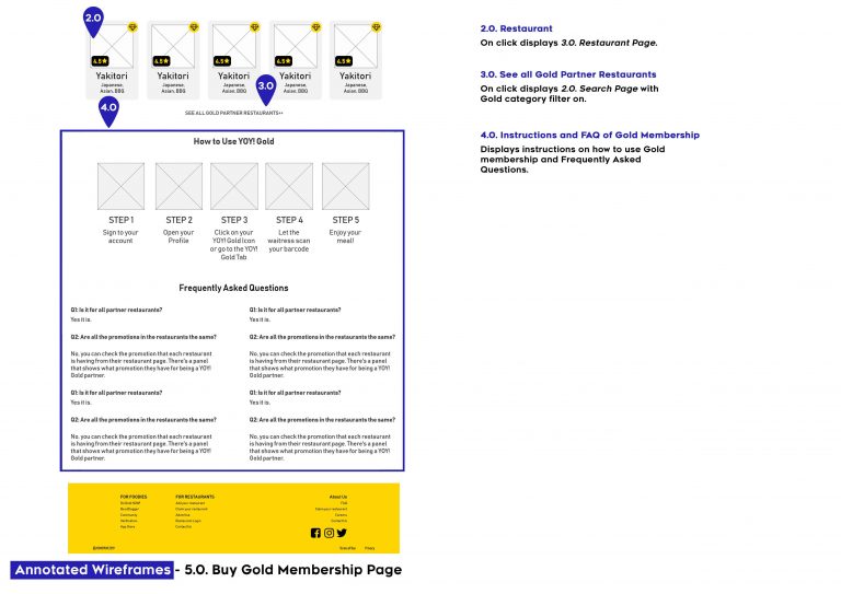
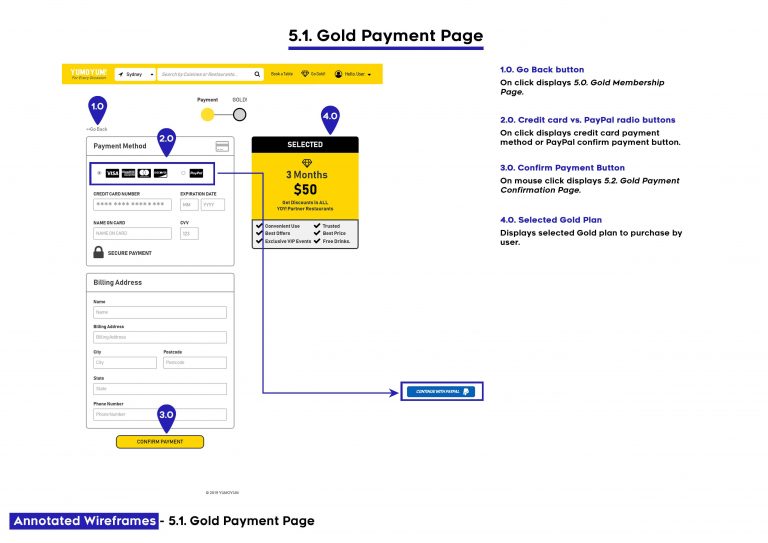
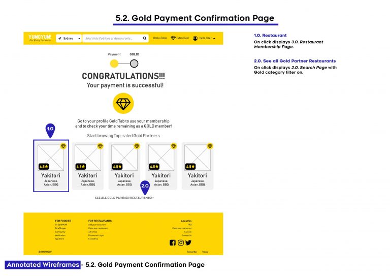
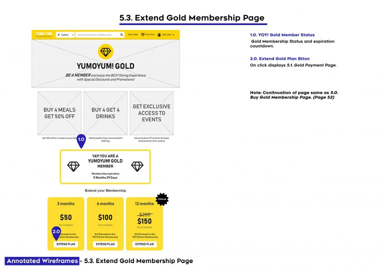
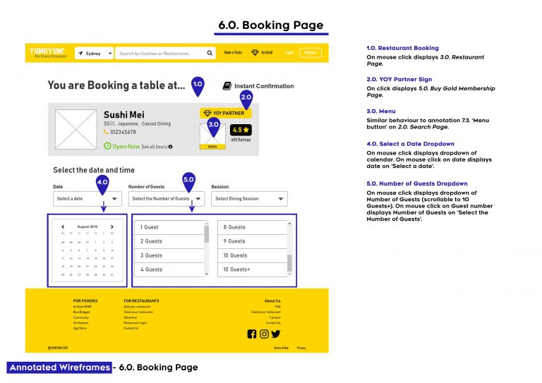
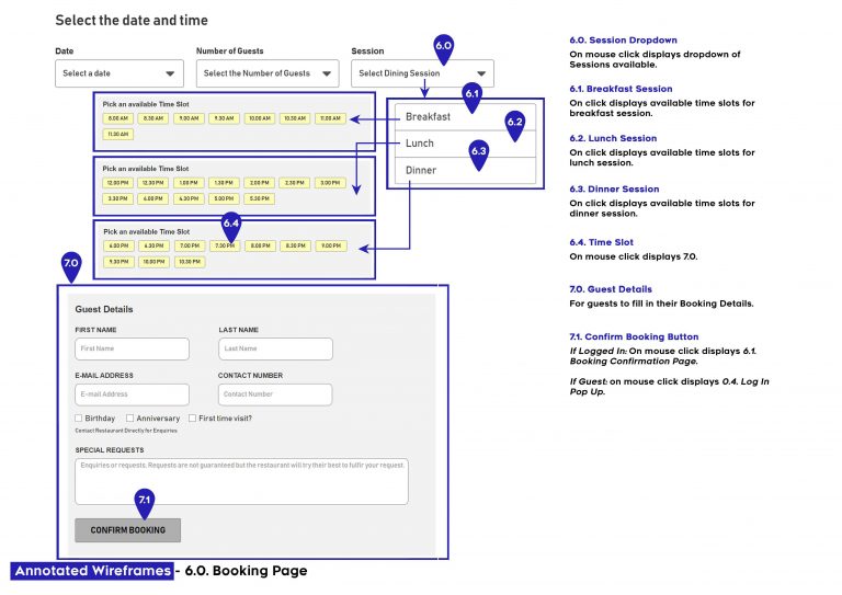
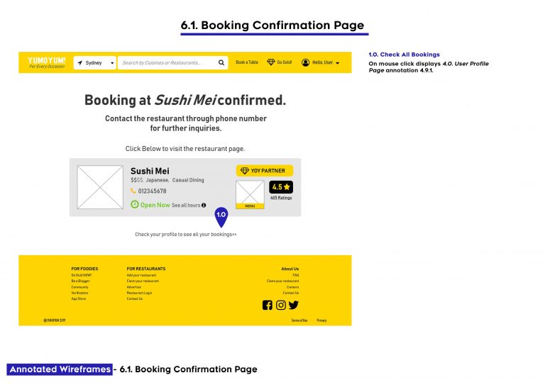
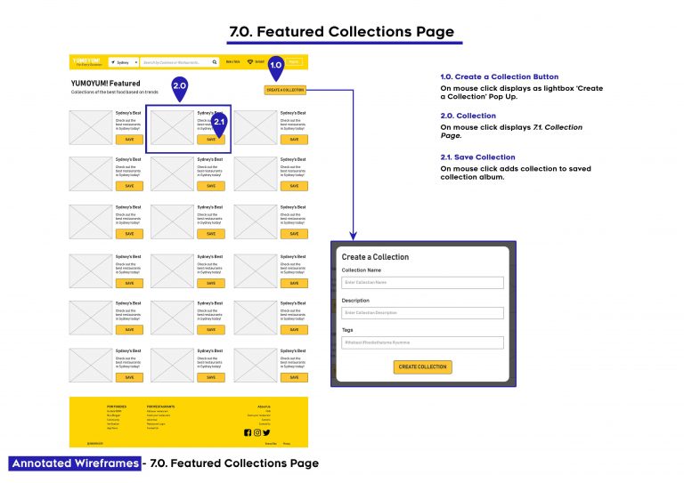
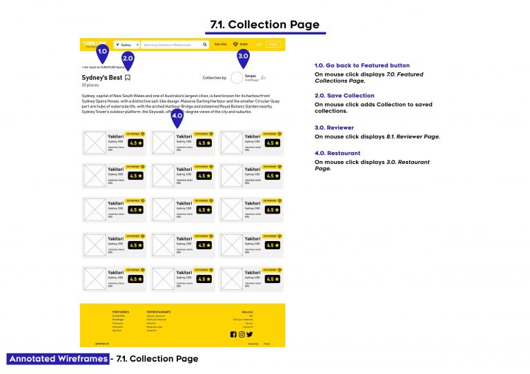
Annotated Wireframes of the prototype.
Usability Testing
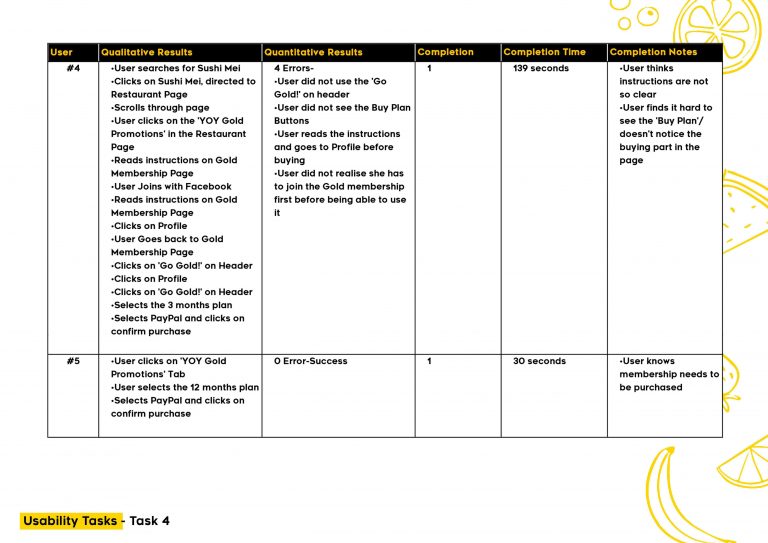
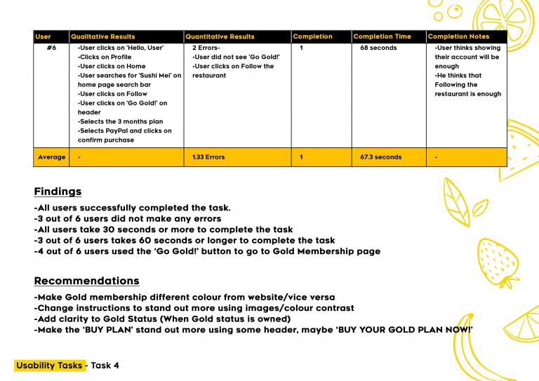
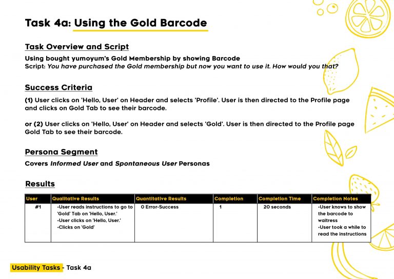
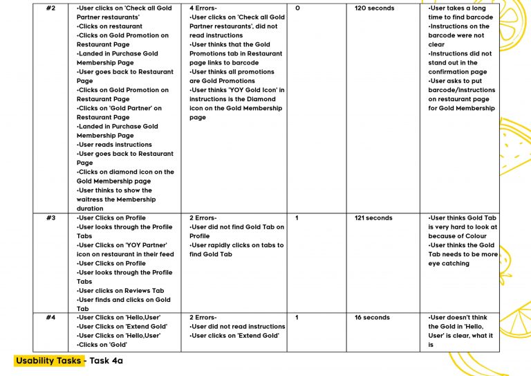
A testing and recruitment plan was created, which included scripts of tasks for usability testing of yumoyum’s prototype. The tasks are meant to test if the key features provided by the website (e.g. booking or searching for a restaurant) work and whether they provide good user experience. Each task has a success criteria which will determine the success rate of each task.
A usability test was conducted on 6 participants who represented two different key personas for the product. The participants are given the tasks and data of each test are compiled to determine key findings and propose recommendations to fix any usability issues identified. The main findings of the test were 1) key buttons need to stand out more in the page, 2) users completed most of the tasks given to them while using the prototype (especially the simple ones are completed relatively fast), 3) most users liked the promotions given from the membership. Additionally, recommendations are added from the users’ suggestions to improve the user experience further.
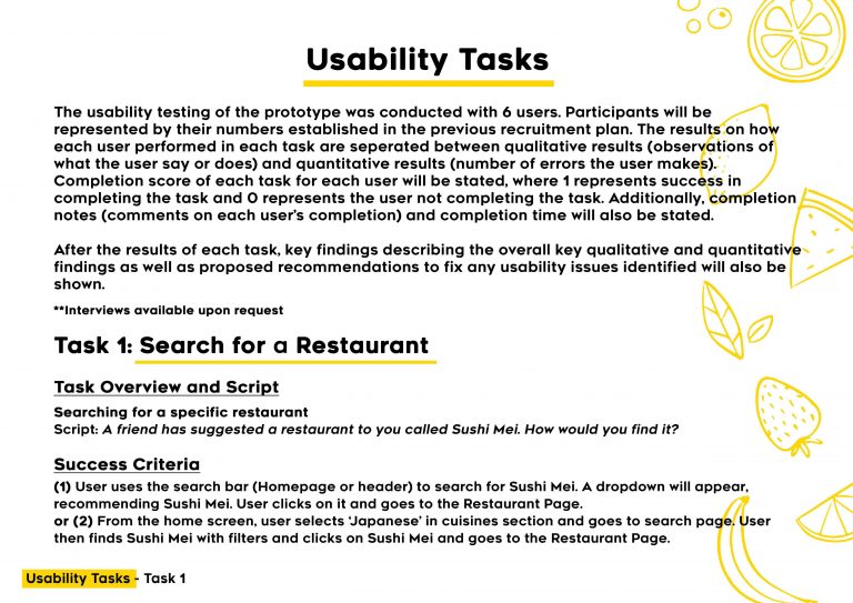
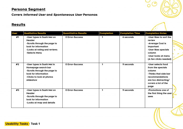
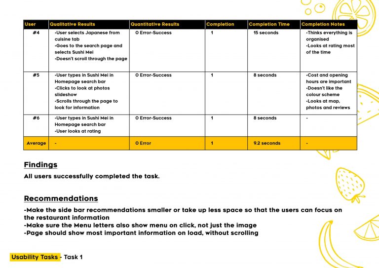
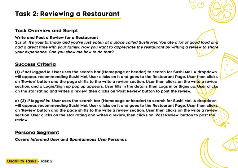
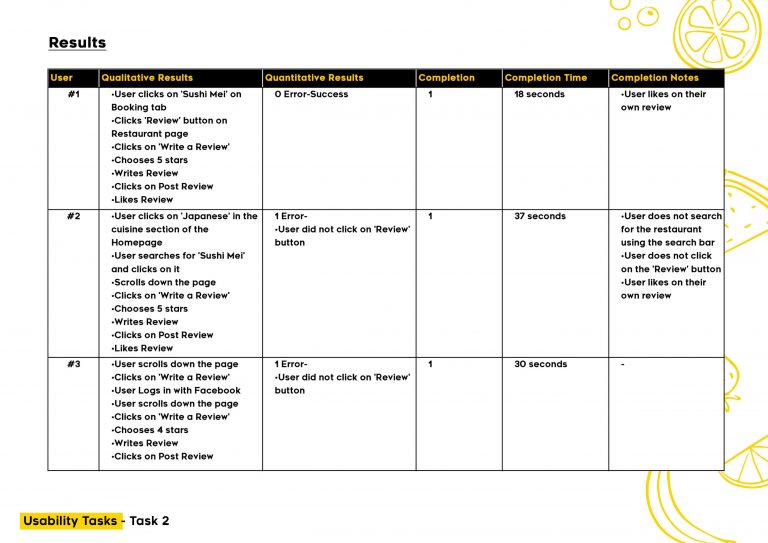
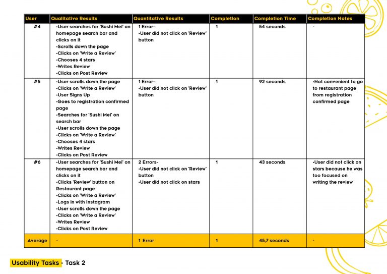
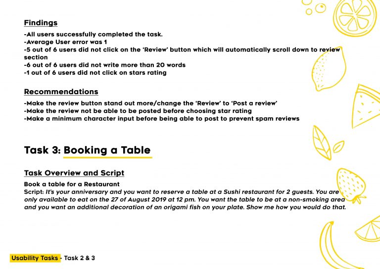
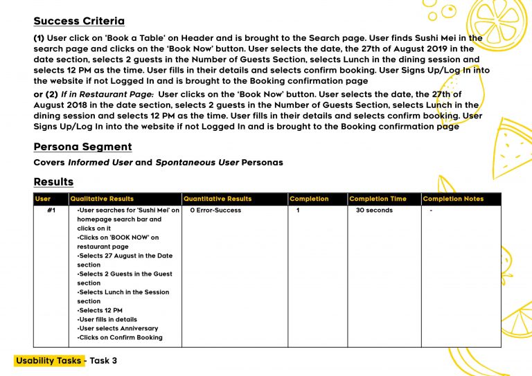
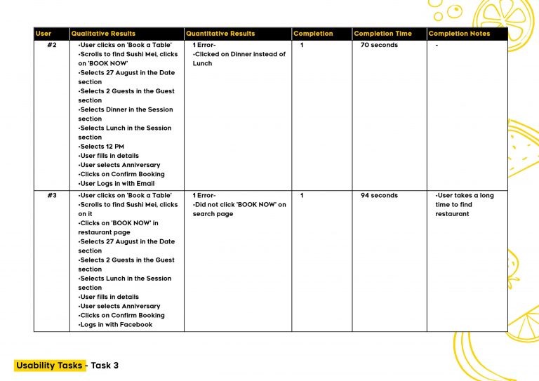
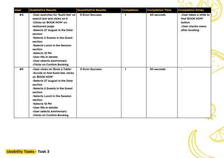
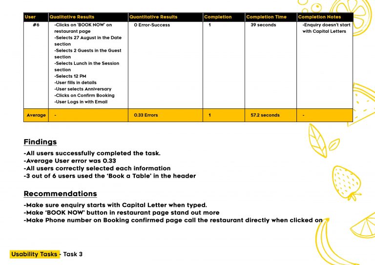
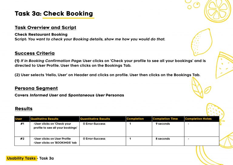
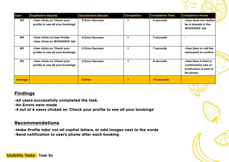
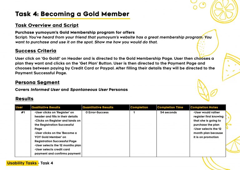
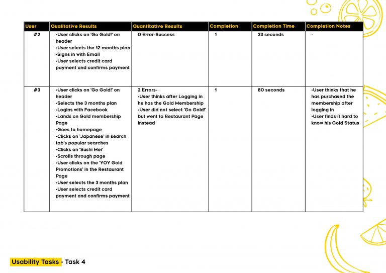
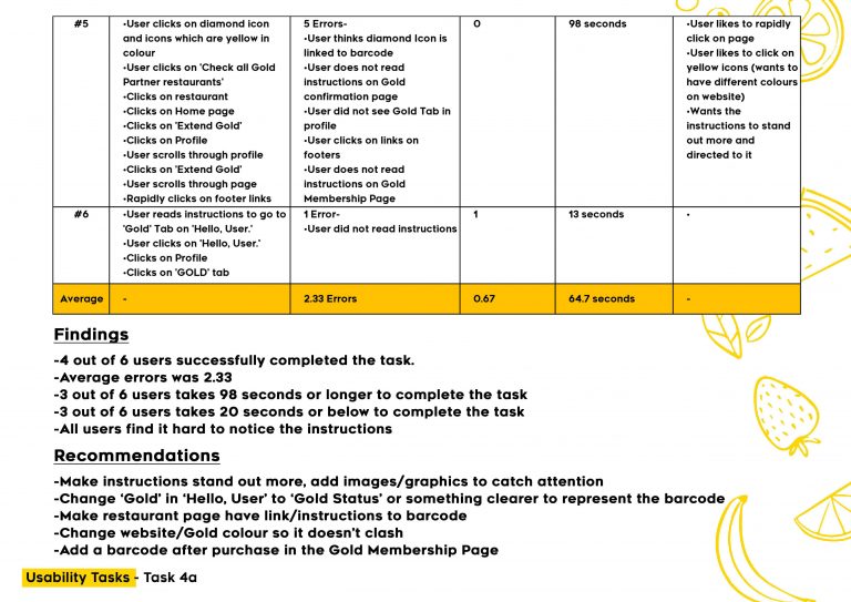
Details on the usability testing.
Outcome
A testing and recruitment plan was created, which included scripts of tasks for usability testing of yumoyum’s prototype. The tasks are meant to test if the key features provided by the website (e.g. booking or searching for a restaurant) work and whether they provide good user experience. Each task has a success criteria which will determine the success rate of each task.
A usability test was conducted on 6 participants who represented two different key personas for the product. The participants are given the tasks and data of each test are compiled to determine key findings and propose recommendations to fix any usability issues identified. The main findings of the test were 1) key buttons need to stand out more in the page, 2) users completed most of the tasks given to them while using the prototype (especially the simple ones are completed relatively fast), 3) most users liked the promotions given from the membership. Additionally, recommendations are added from the users’ suggestions to improve the user experience further.